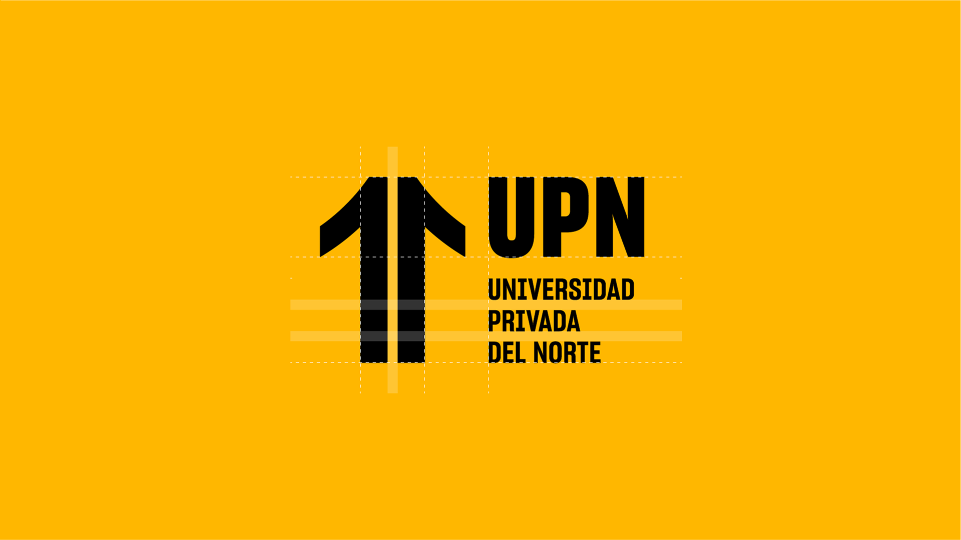
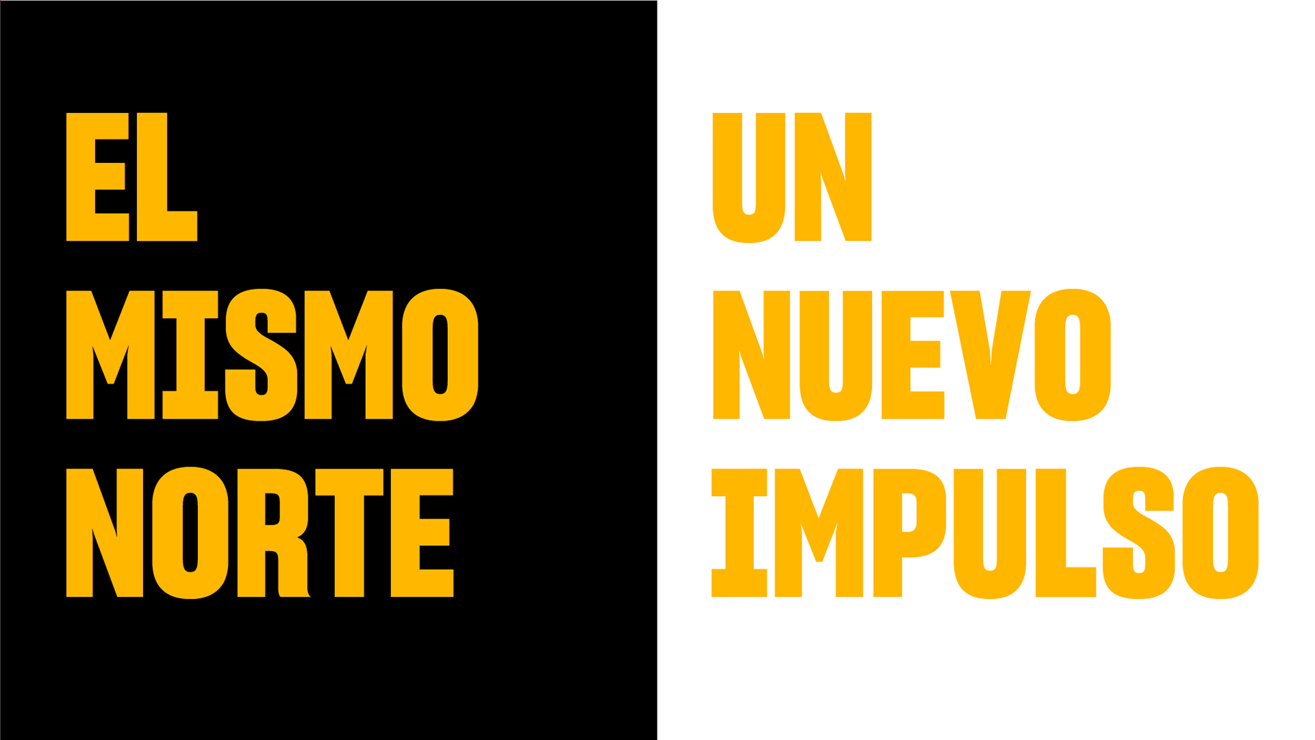
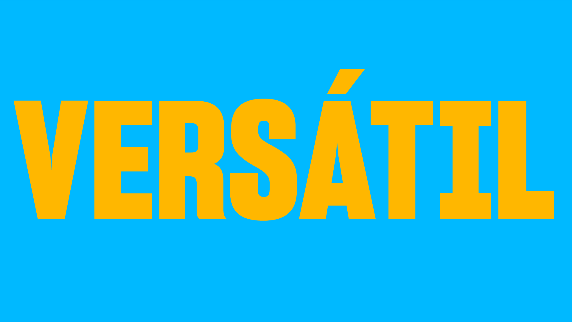
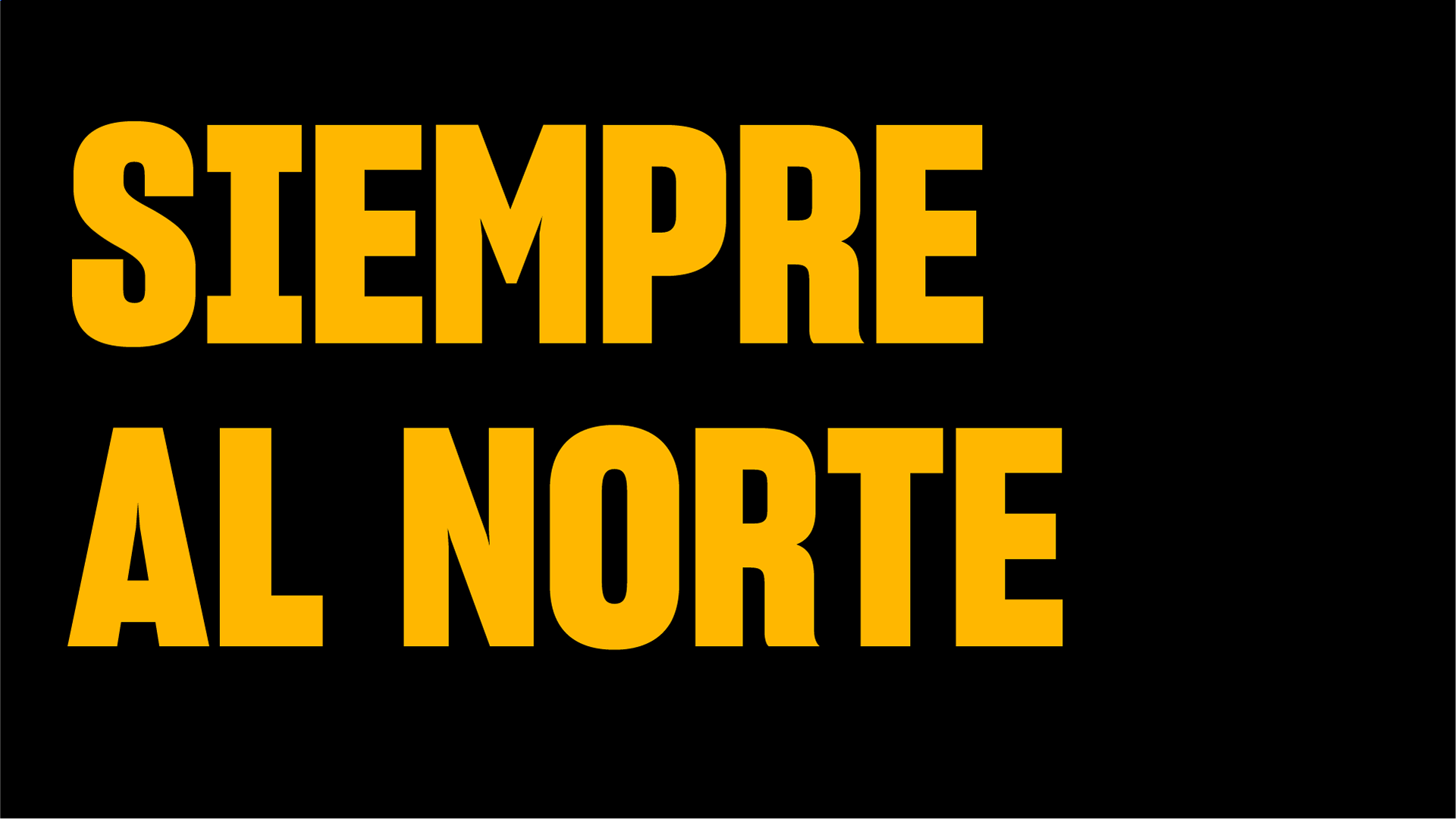
UPN: To the North
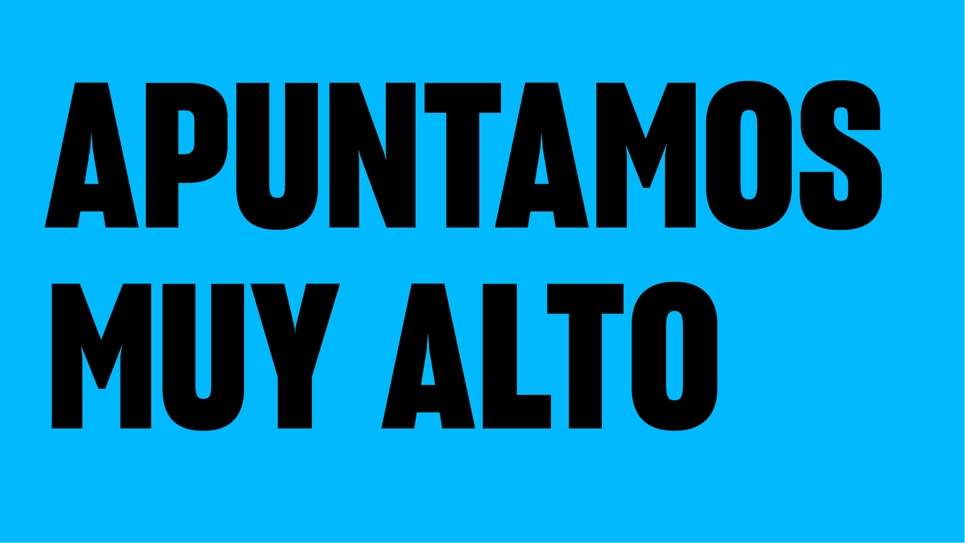
We aim high, always to the north. A new vision for a renewed educational institution, the university of the nort: UPN was ready to compete. I was aproached to give the illusion of life to the new visual identity that reflects who is the university as an ever-evolving institution.
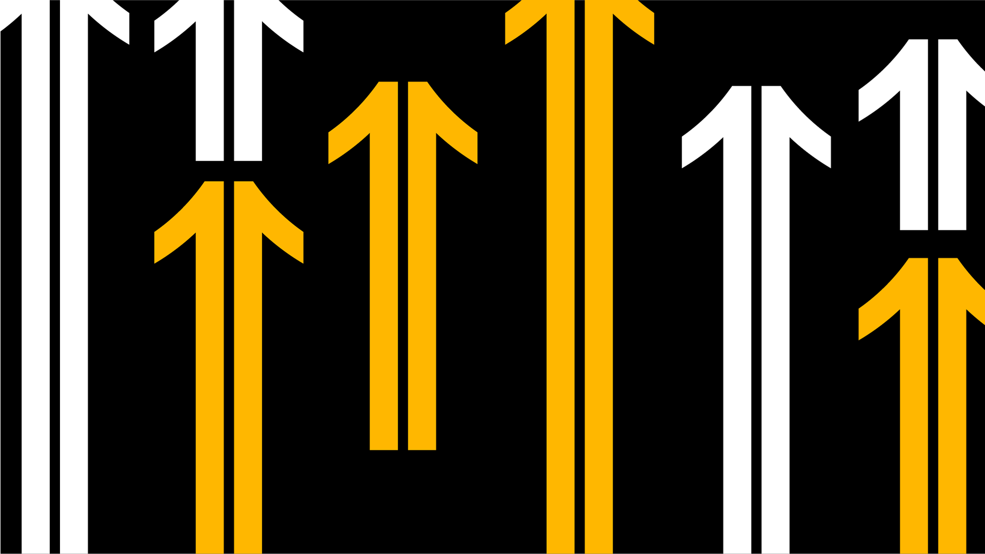
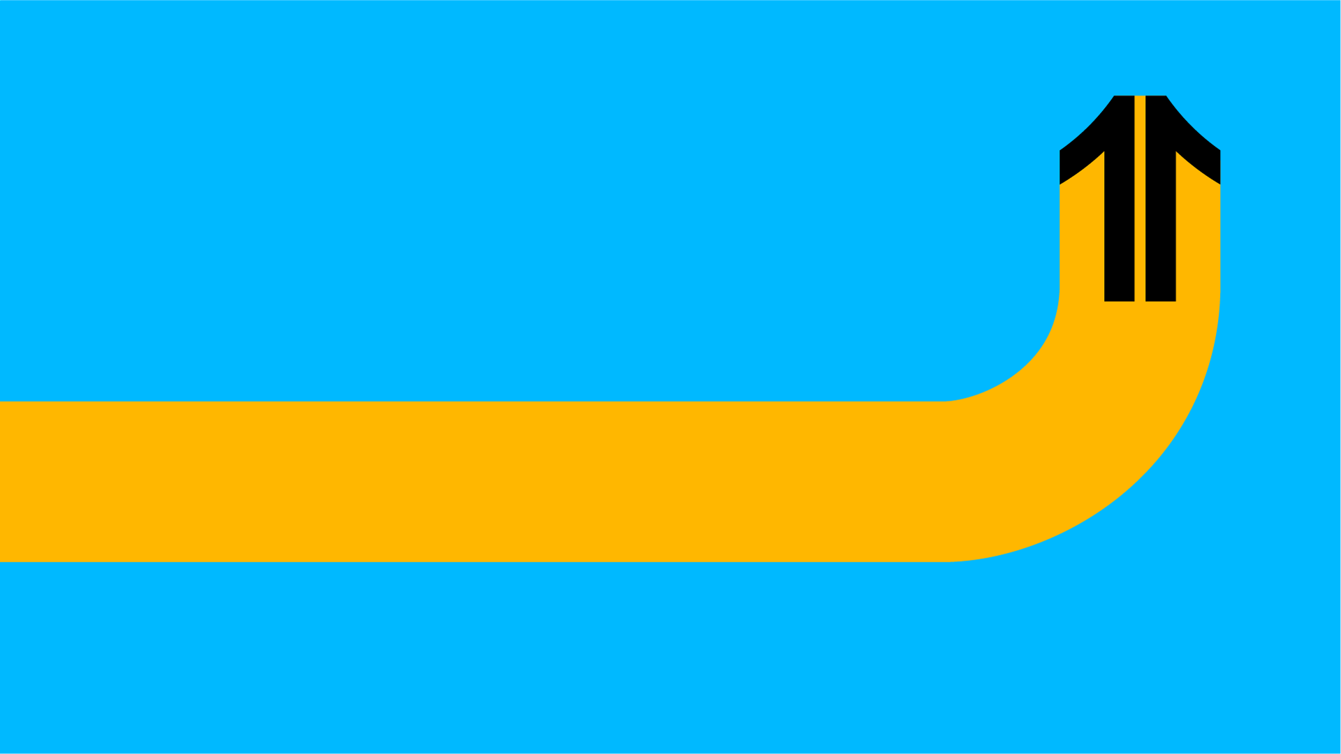
The first step was to define the visual concept that would be the foundation of the video. Eventually, a simple concept was chosen: What if we go north? If the rebranding is aming to the north, why don't we go with them?
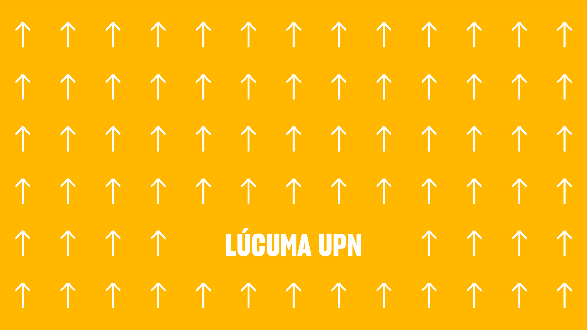
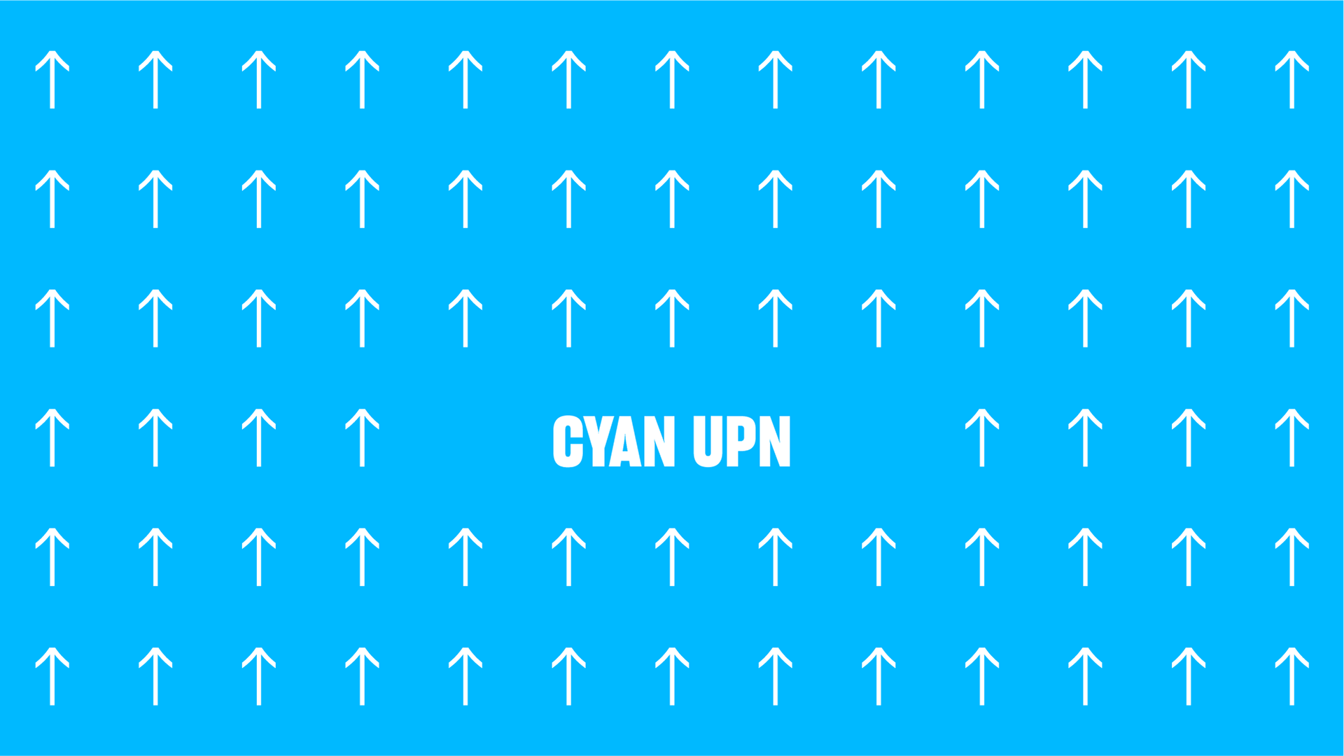
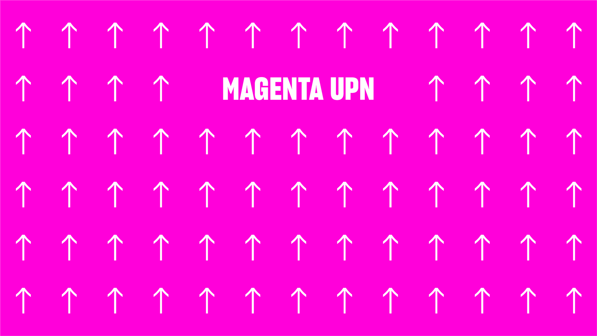
The result was a bold and dynamic video with emphasis on upward movements, that expresses everything the rebranding has to give.
Client: UPN - Studio: Sentido - Year: 2021 - Art direction: Castor Vera - Graphic design: Leo Chavez - Motion Design: Andre Ramirez
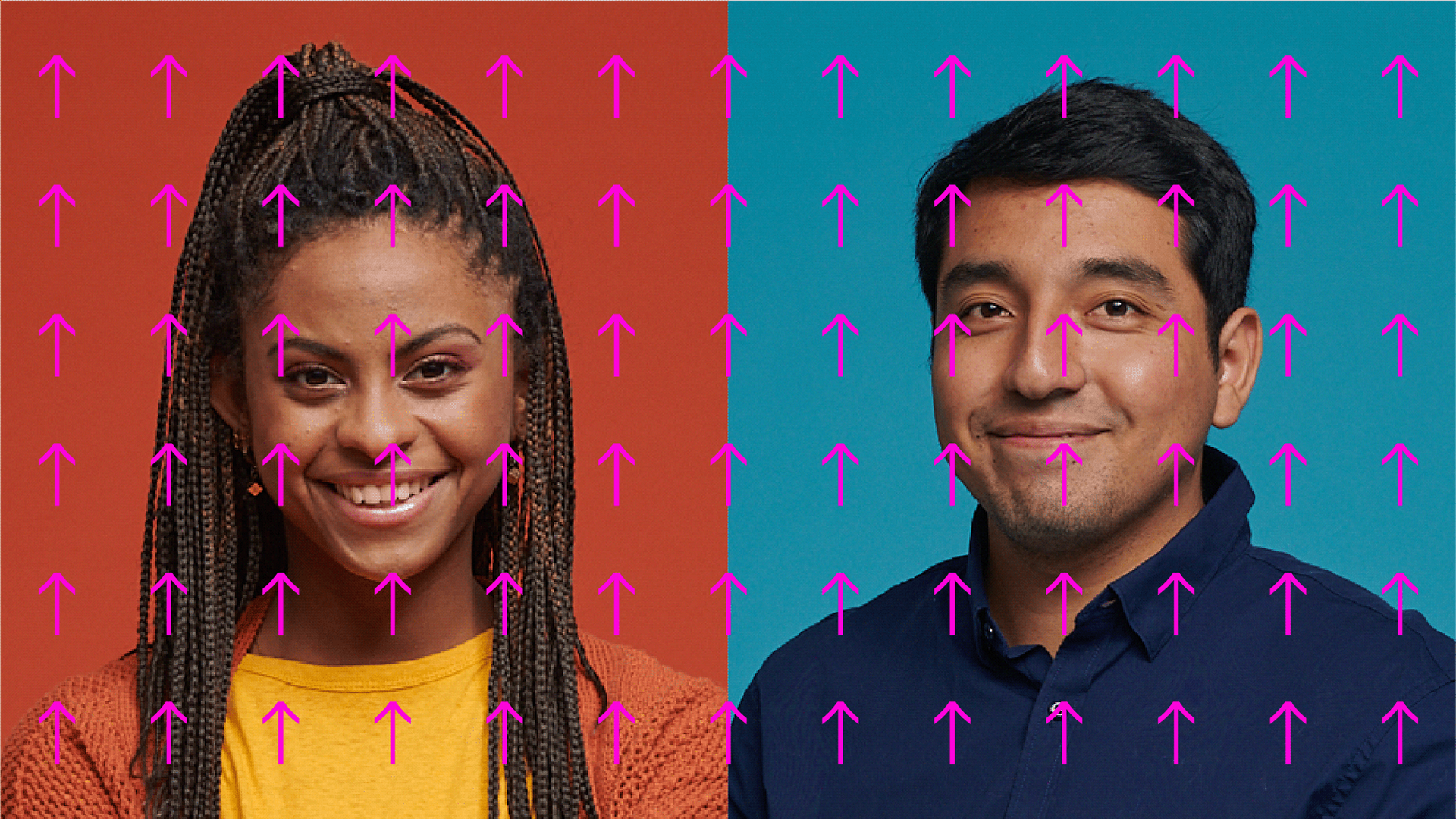

With ease
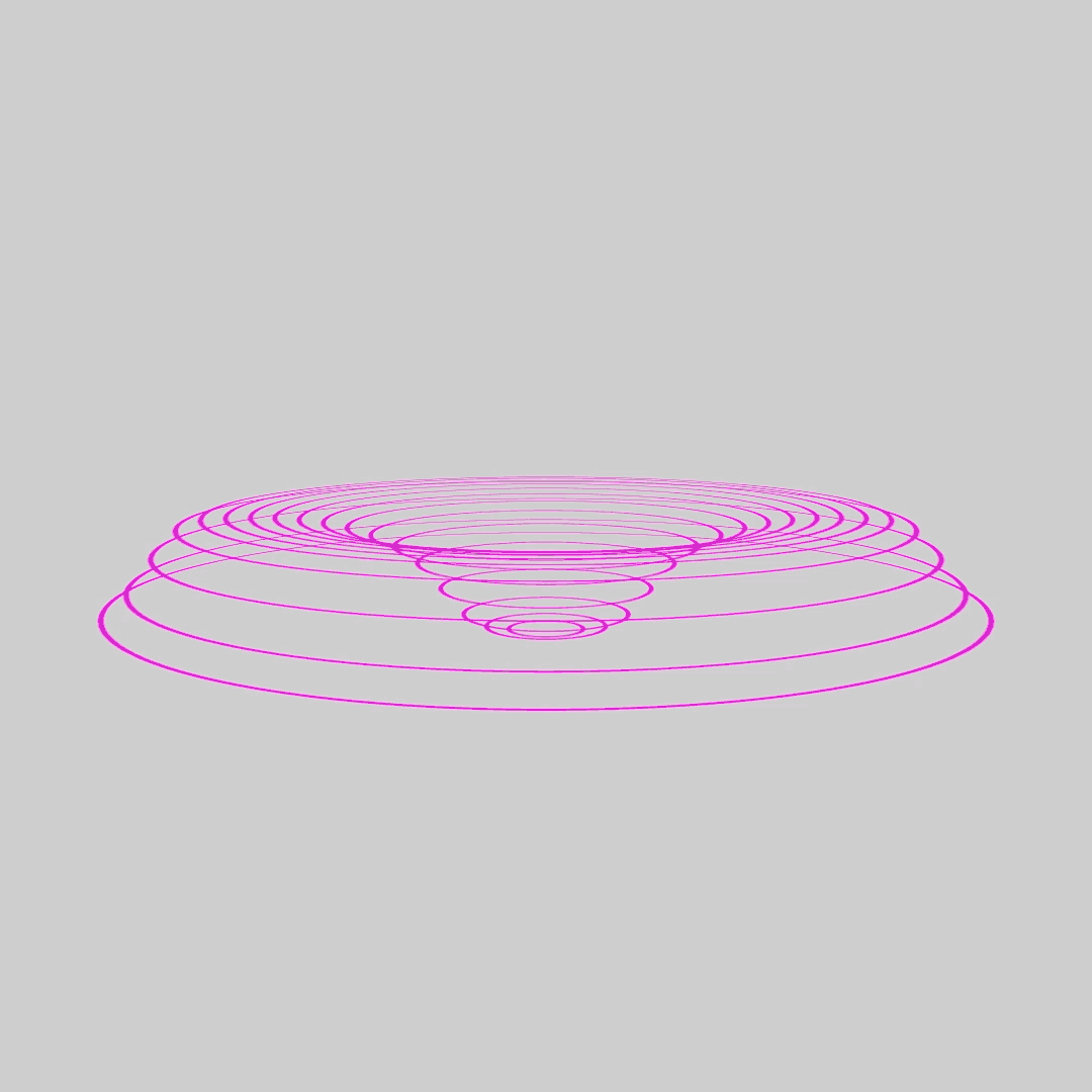
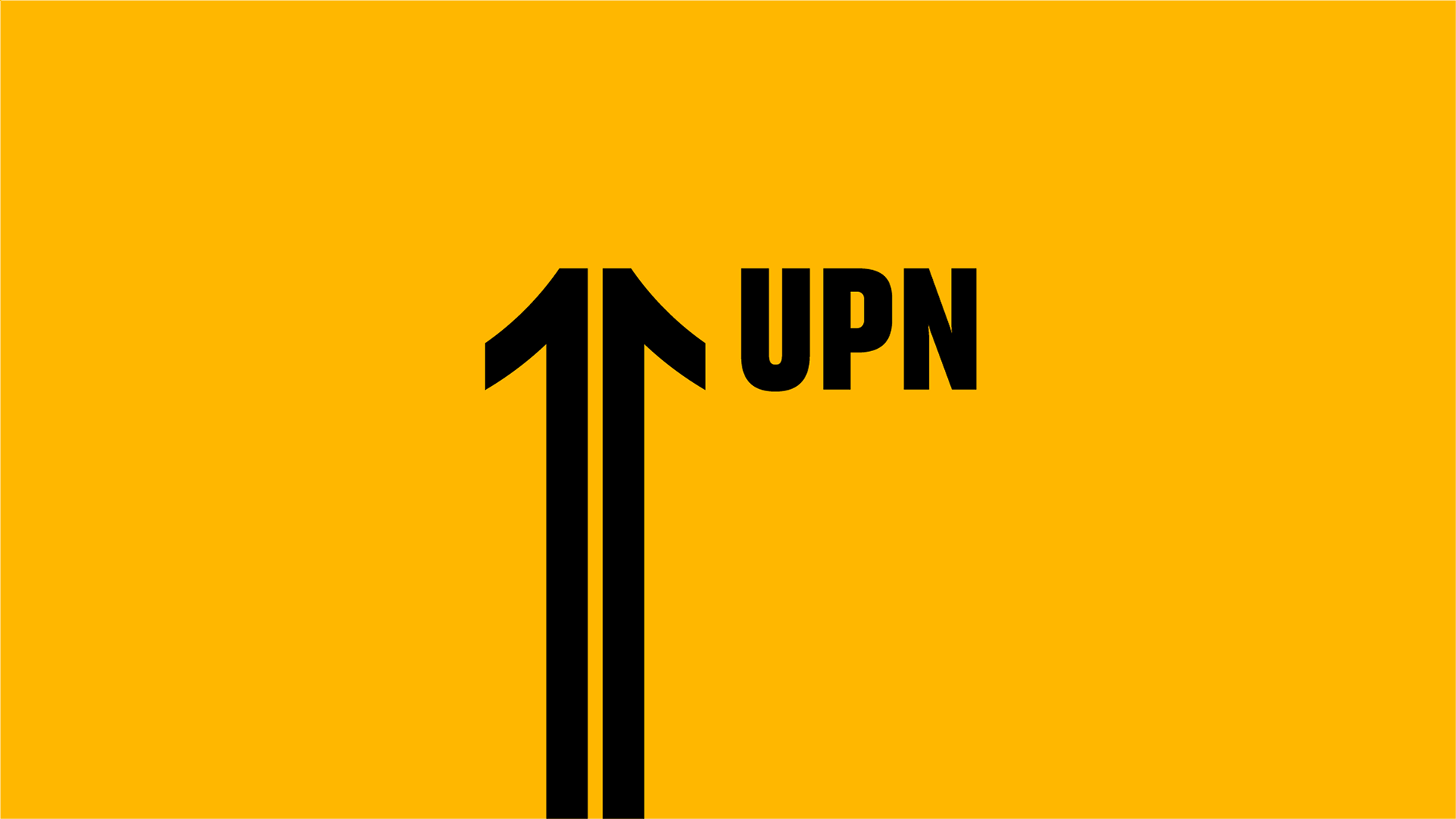
Handmade curves were the key to emphasize the change of direction -from the bottom up-. Along with this, the sudden changes in speed were perfect to make quick and dynamic cuts.
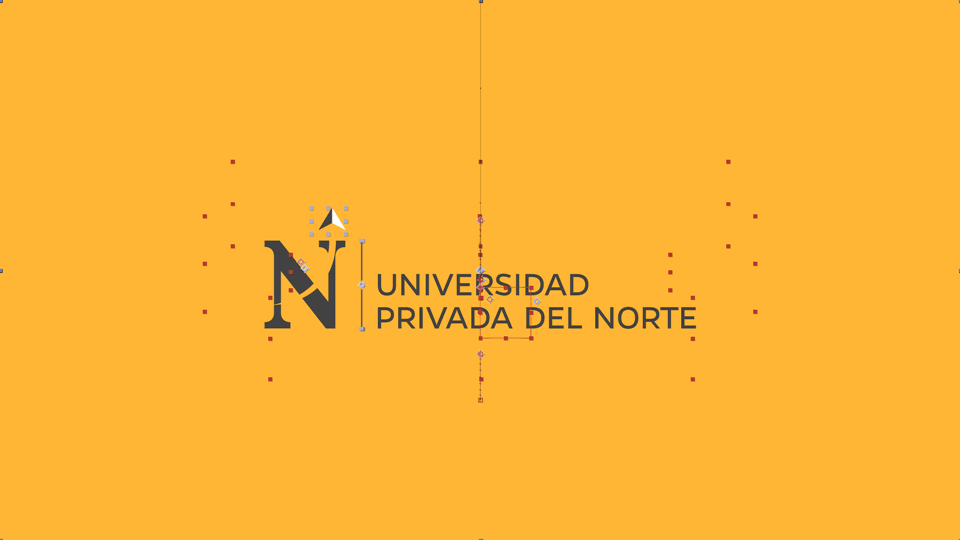
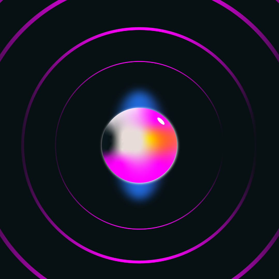
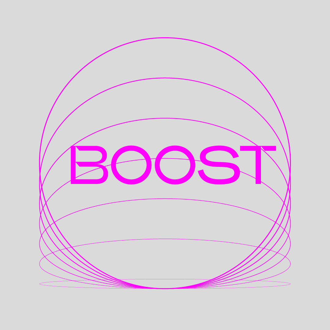
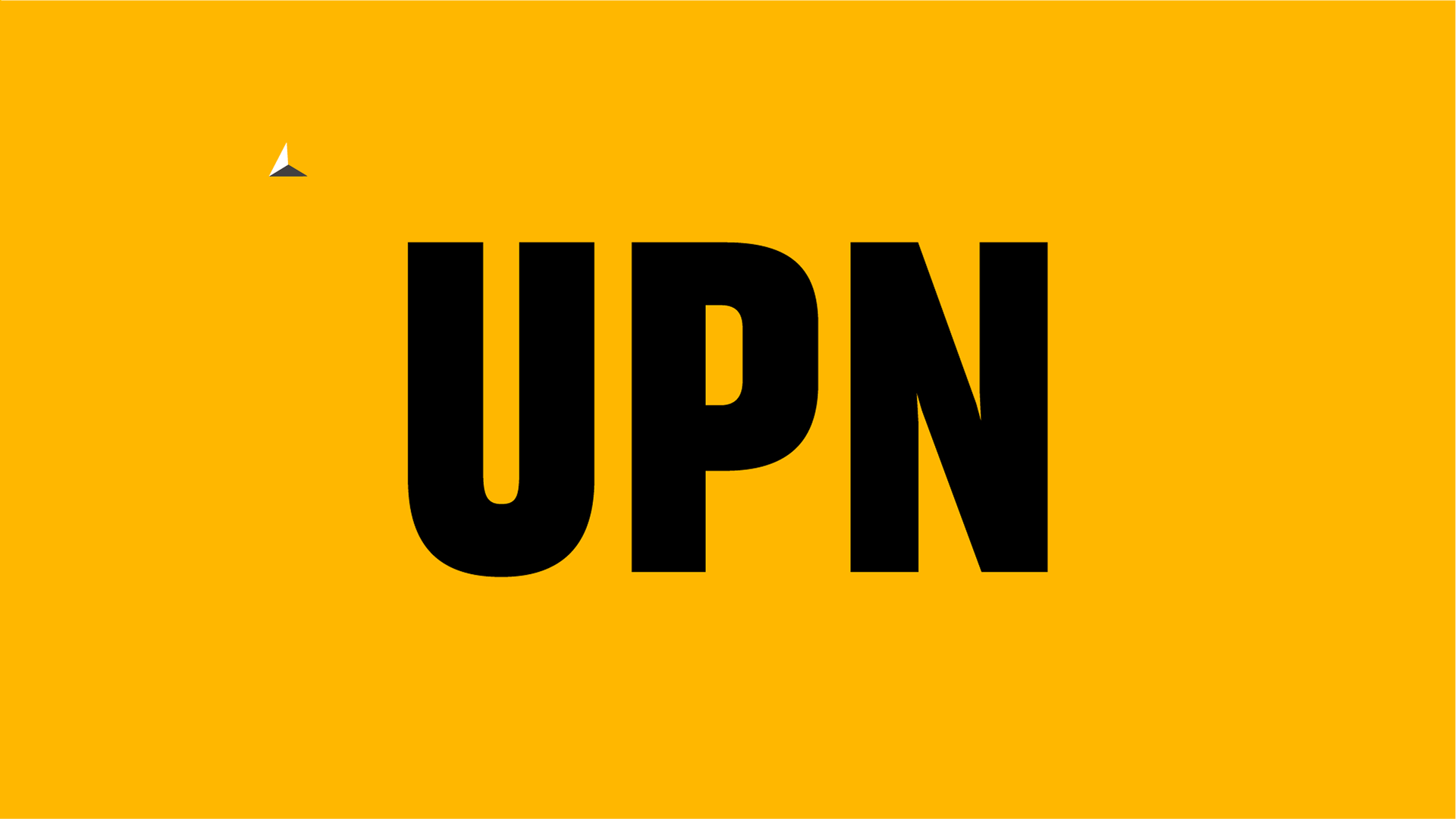
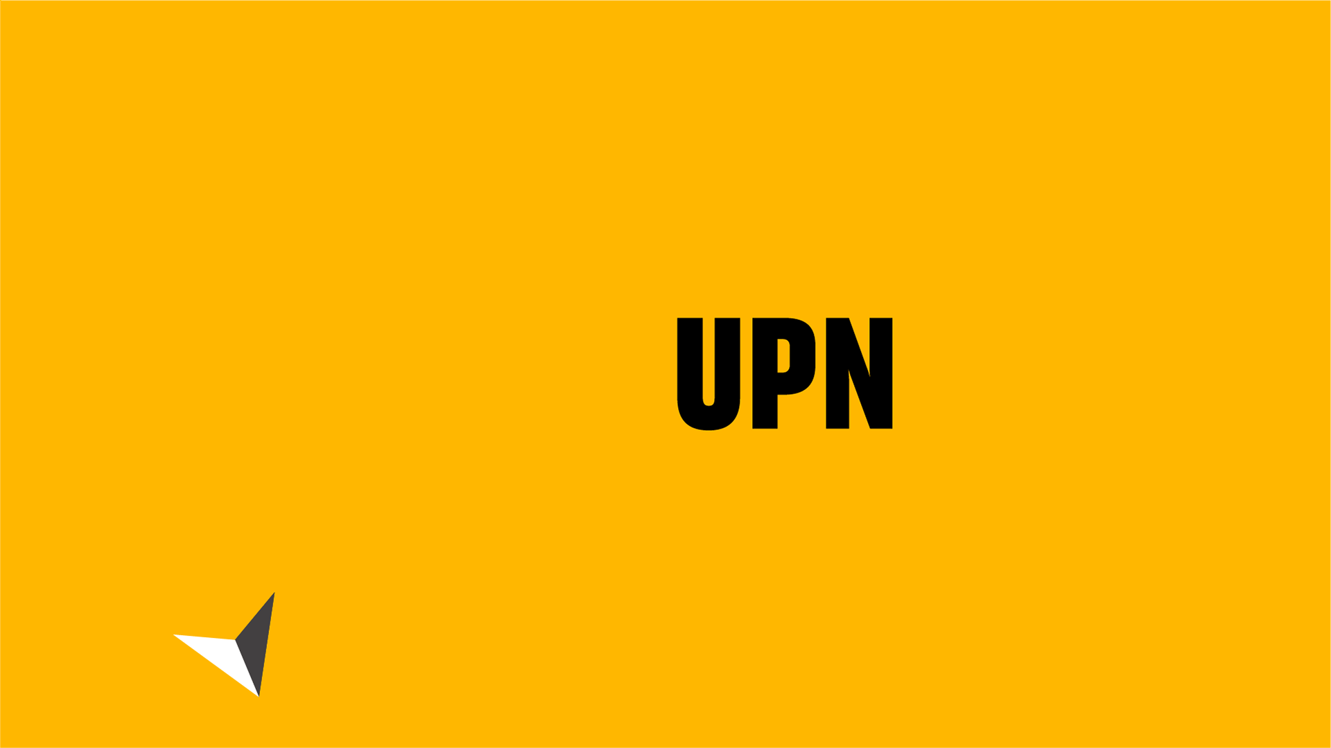
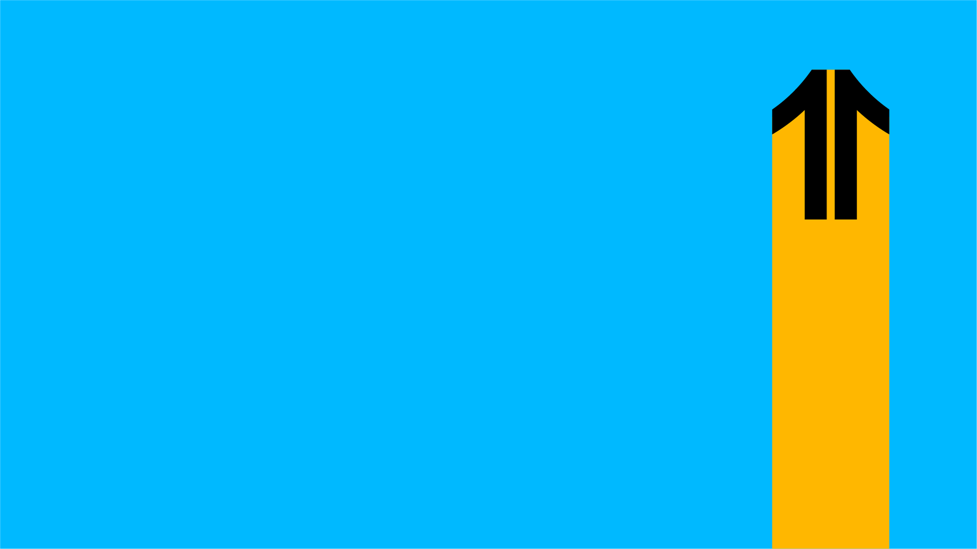
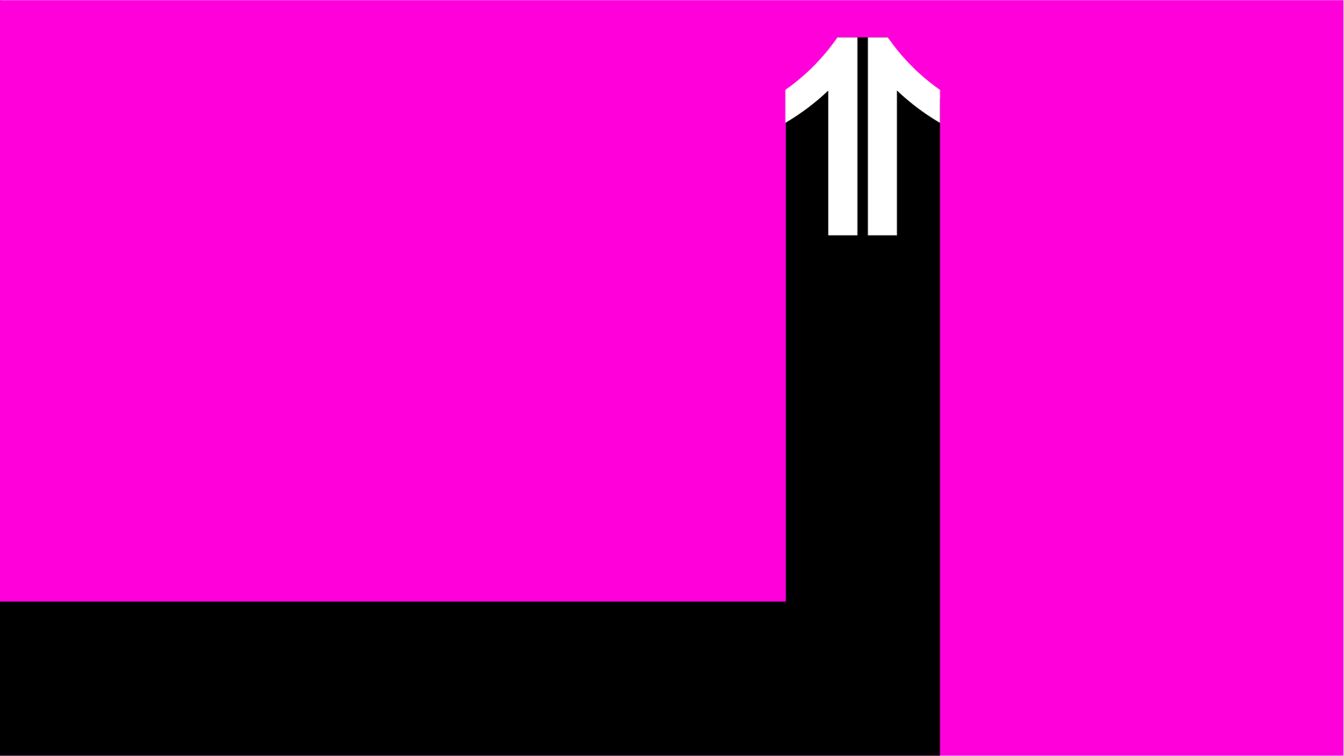
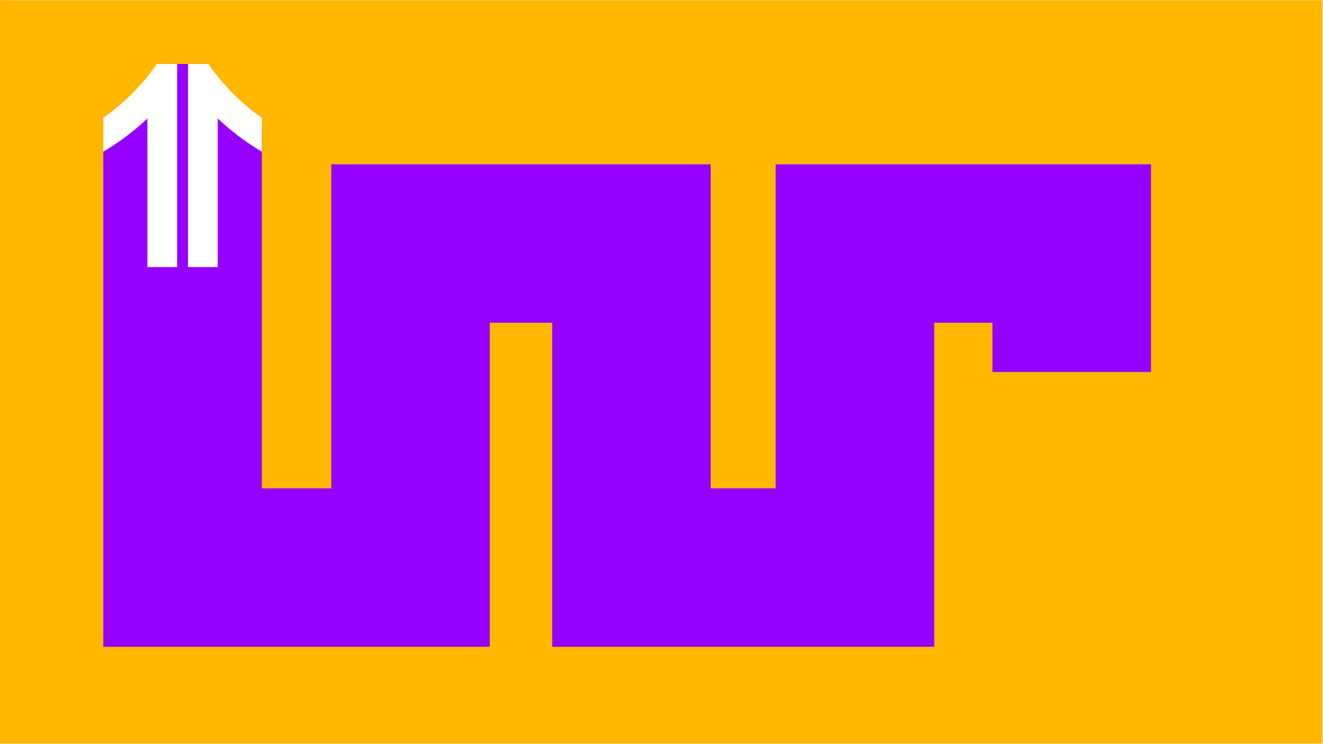
This is especially highlighted in presentation of the new logo. In the change of logo everything explodes and the new identity takes shape.
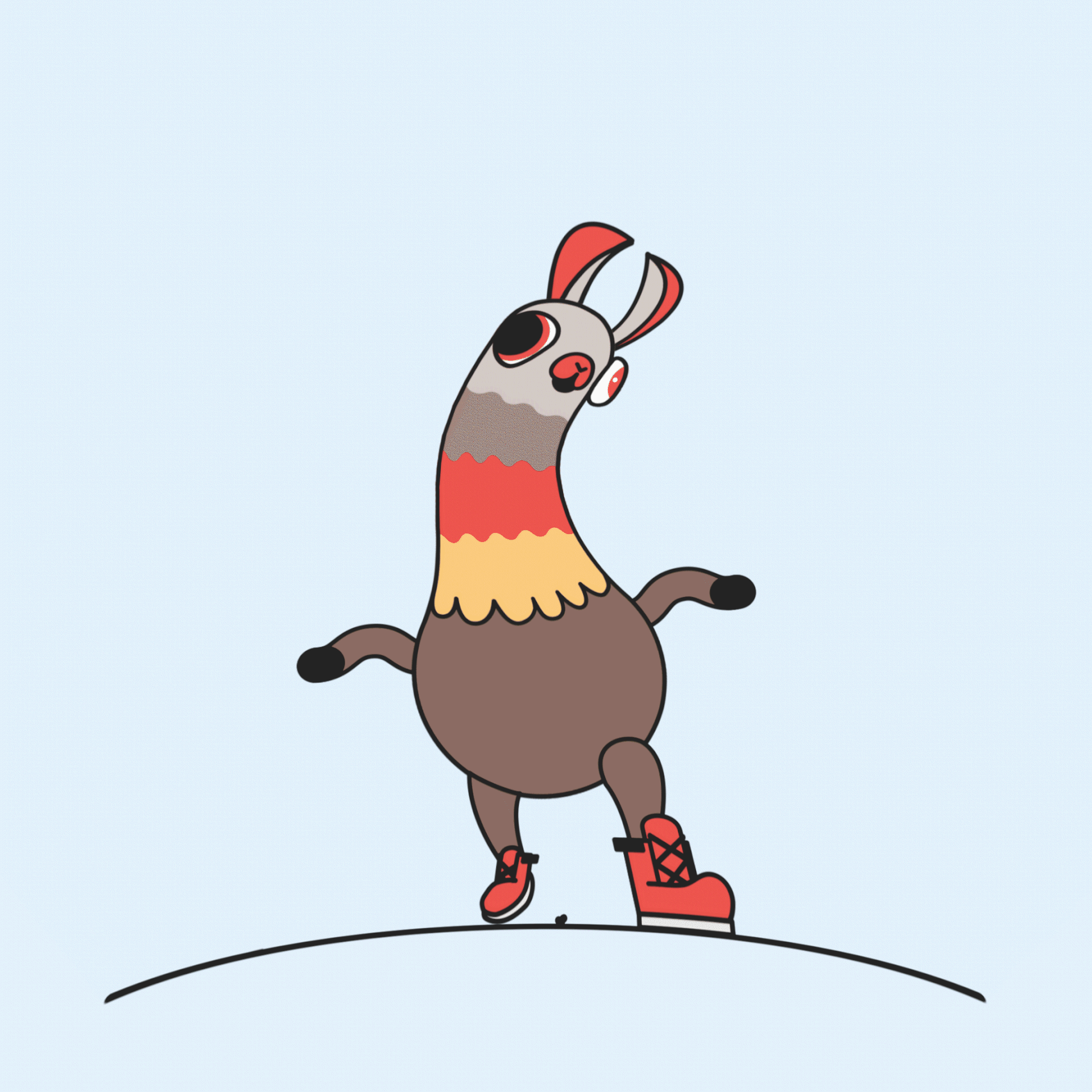
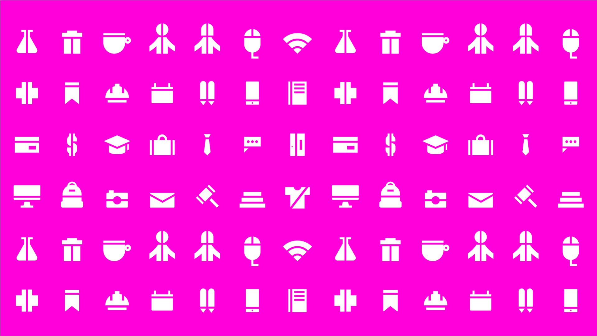
We played with linear movements to reinforce the geometric shapes of the graphic identity -especially the iconography-. The Icon of the logo was fundamental to express the movement of the piece.